


The Brief
Appealing to Today's Youths

Enter Young NTUC, the dynamic youth wing of the National Trades Union Congress (NTUC). Their mission? To amplify the voices and meet the needs of young workers.
At the heart of their efforts lies the NTUC Starter Membership, a vital initiative supporting individuals aged 18-25 in the realms of Work, Live, and Play. Now, Young NTUC is on a mission to expand its reach.
Their aim is to:
-
Attract more visitors to the membership site
-
Drive sign-ups
-
Retain existing members.
That's where our expertise comes into play – enhancing the site's appeal and keeping users engaged with its offerings.
Challenge #1
Resolving the Usability Issues of the Current Site
From the very start, navigating the current site felt like a maze. It took us a long time to grasp the main offerings of the membership, based solely on the scattered information available.
To ensure our observations weren't biased, we brought in eight users to test the site.
These are the 2 main issues that were identified:

1
Navigating the site was challenging
Users struggled to connect the content on the homepage with the menu items.

2
The site lacked substantial information
Many links redirected the users elsewhere, making it hard to fully understand the membership's offerings.
These insights highlighted the core issues we needed to address before introducing new, exciting features.
Our Solution
Reorganizing the Site & Integrating Essential Information
Complete reorganization of the homepage and menu


Membership offerings on the menu and home page were unclear, with no emphasis on the core pillars of "Work, Live, Play."


Complete reorganization of the homepage and menu reorganization
Consolidating essential information from other sites

There was a significant lack of information, with only one work-related event listed. Some offerings were only available on NTUC's other websites

Challenge #2
What Drives Youths to Sign Up for a Membership?
With the fundamental issues addressed, it was time to dive deeper. What really drives youths to sign up for a membership?
To uncover this, we conducted over 20 interviews and sent out a survey with 30 respondents.
These are their 2 main motivating factors:

1
Relevance is key
Youths need to be sure that the membership’s offerings align with their needs.
Relevance is key

2
Easy access to information is crucial
Youths want to quickly and easily understand what the membership offers before committing.
These insights would guide our next steps in making the membership site truly engaging and valuable for young users.
Our Solution
1
Demonstrate the Membership's Worth With Tangible Proof

Success Stories
We propose a digital gallery of real-life success stories for users to explore. Each narrative resonates personally, sparking their curiosity and sense of belonging within our vibrant community of achievers.
Event Archives
Our proposal includes an accessible event archive, where users can immerse themselves in past gatherings. With each photo and summary capturing the essence of these events, they'll feel inspired to become an active participant.

2
Simplify Access to Essential Information

Visual Appeal and Concise Information
We propose using eye-catching graphics and concise information, allowing users to effortlessly navigate through. With key details at their fingertips, they can quickly explore their options and delve deeper into any area of interest.
Filters
Empowered by our filtering system, users can refine their search based on their interests and preferences. This ensures they find exactly what they need, making their experience seamless and efficient.

Testing our Solution
Incorporating User Feedback for Improvements
With our solution ready, we embarked on a journey of testing and refinement, gathering insights from the very users we aim to serve. Following which, we made some changes according to their feedback.
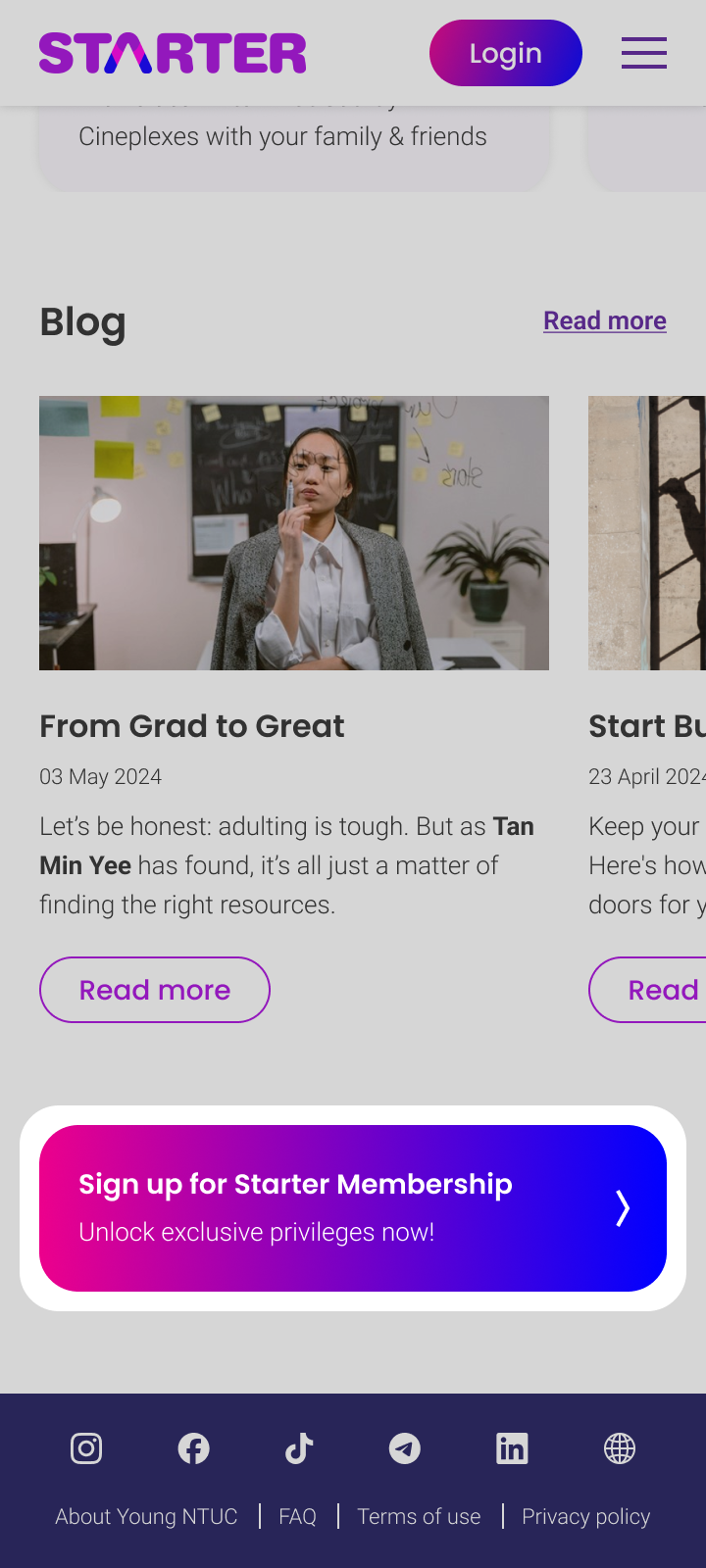
More evident sign-up prompts and pricing information

Users wanted clearer prompts to join the membership after exploring the offerings. Previously, we only had a sign-up button at the top.

They also struggled to find pricing information for the membership. There was no mention of it in the "About Starter" section.

Enhancing accessibility to the UTAP page

The Union Training Assistance Programme (UTAP) encourages members to go for skills upgrading courses, but new users struggled to find it.

Initially it can only be found under the "Career Resources" page.


Clearer deals redemption process

Users were unaware they needed to present their e-card to redeem membership deals. The instructions were easily missed, with no mention of an e-card.

Some users didn't realize they could access the e-card by clicking the profile icon at the top.


Testing our Solution
Incorporating User Feedback for Improvements
With our solution ready, we embarked on a journey of testing and refinement, gathering insights from the very users we aim to serve. Following which, we made some changes according to their feedback.
More evident sign-up prompts and pricing information
Users wanted clearer prompts to join the membership after exploring the offerings. Previously, we only had a sign-up button at the top.
They also struggled to find pricing information for the membership. There was no mention of it in the "About Starter" section.
Enhancing accessibility to the UTAP page
The Union Training Assistance Programme (UTAP) encourages members to go for skills upgrading courses, but new users struggled to find it.
Initially it can only be found under the "Career Resources" page.
Clearer deals redemption process
Users were unaware they needed to present their e-card to redeem membership deals. The instructions were easily missed, with no mention of an e-card.
Some users didn't realize they could access the e-card by clicking the profile icon at the top.
Next Steps
Client Feedback and Prioritizing Key Changes
Following the presentation of our proposal to Young NTUC, they were convinced by its potential and are enthusiastic about delving into our suggestions. As they gear up to embark on the journey of implementing a revamped site, they've sought immediate priorities to drive the project forward.
Here are our key suggestions for their interim solution:
1
Streamline Content
Let's restructure the site around the core pillars of Work, Live, and Play, making it effortless for users to grasp the essence of the Starter membership.
2
Enrich Content
We propose integrating relevant content from NTUC's other platforms, injecting depth into the site's information and amplifying its value for users.
3
Boost Visibility
By showcasing more offerings on the pre-login page, we aim to attract non-members, inviting them to join the vibrant community and enhance their experience from the outset.
With these key suggestions in place, we envision Young NTUC captivating more youths and fostering increased sign-ups, paving the way for vibrant community engagement and meaningful connections.
Testing our Solution
Incorporating User Feedback for Improvements
With our solution ready, we embarked on a journey of testing and refinement, gathering insights from the very users we aim to serve. Following which, we made some changes according to their feedback.
More evident sign-up prompts and pricing information
Users wanted clearer prompts to join the membership after exploring the offerings. Previously, we only had a sign-up button at the top.
They also struggled to find pricing information for the membership. There was no mention of it in the "About Starter" section.
Enhancing accessibility to the UTAP page
The Union Training Assistance Programme (UTAP) encourages members to go for skills upgrading courses, but new users struggled to find it.
Initially it can only be found under the "Career Resources" page.
Clearer deals redemption process
Users were unaware they needed to present their e-card to redeem membership deals. The instructions were easily missed, with no mention of an e-card.
Some users didn't realize they could access the e-card by clicking the profile icon at the top.
